Can governments really change retirement saving habits?
- a comparison between Australia and New Zealand
Michael Littlewood¹
Key points:
Australia's compulsory system has transformed how household wealth is packaged there: superannuation is 49% of Australian household financial assets against 11% in New Zealand.
However, it has not made households wealthier, relative to their incomes: net worth is nine to ten times income in both countries, and the median New Zealand adult ranks fourth in the world for wealth, only one place behind Australia.
Australian household debt has climbed to 177% of income while New Zealand's has been flat at about 125% for two decades.
Once Australia's superannuation tax concessions are counted, the true fiscal gap between the two retirement systems over the long-term is roughly half what the headline superannuation numbers suggest.
Poverty rates amongst the old in each country also don’t establish a ‘winner’.
Nothing in the available data shows widespread under-saving in New Zealand.
This paper suggests that compulsion can wait until the data exist to justify it.
However, New Zealand does need a data- and research-led discussion about both public and private provision for retirement. We have never done that.
In Compulsory KiwiSaver won’t fix retirement costs (New Zealand Herald, 27 July 2026 accessible here) I suggested that, if we were really worried about the future cost of New Zealand Superannuation, adding compulsion to KiwiSaver would increase the present and future cost of an ageing population (make things worse).
I also said that we don’t have decent data but that what we have don’t reveal a problem, despite what financial service providers keep telling us. The UBS Global Wealth Report 2026² shows that median wealth in New Zealand was 4th (of 30 countries measured), one place back from Australia. Singapore, despite its reputation amongst compulsion’s spruikers, was 20th in 2025.
It’s fiendishly difficult to compare countries’ retirement income systems but I will try, as I describe the differences, and similarities, between New Zealand and Australia. We hear a great deal about Australia, probably because most of our financial service providers are Australian-owned and their own incomes reflect funds under their management.
The comparison is worth the effort because the clamour for a compulsory version of KiwiSaver usually draws on the superficially stunning success of Australia’s ‘Superannuation Guarantee’ scheme (SG). It has been very kind to the retirement saving industry, so we can understand why players on this side of the Tasman might want to repeat the experience.
How many times have you heard the A$4 trillion mantra? In fact, superannuation schemes in Australia now own about A$4.5 trillion³, while our own KiwiSaver schemes have just NZ$138 billion⁴. The comparison is apparently damning.
However, there is much more to the story if we want to understand what’s really happening under the hood.
The environments
For openers, our New Zealand Superannuation (NZS) is similar to Australia’s Age Pension:
both are non-contributory, Pay-As-You-Go (PAYG) state pensions⁵,
with low qualification barriers: NZS requires 10 years’ residence, rising to 20 years by 2044⁶; the Age Pension requires 10 years.
The state pension age is 65 in New Zealand and 67 in Australia⁷.
Both pensions are nominally taxable and the total for a married couple before tax is A$47,070 a year before tax there (March 2026) and NZ$51,182 here (April 2026).
The single-person’s rate in each country is about two-thirds of the married.
But, and here’s the major difference in the two taxpayer-provided pensions: the Age Pension is income- and asset-tested; NZS is universal; paid to all regardless of ‘other’ income or assets.
That’s not all. There are significant differences in the treatment of ‘private’ savings. I use that qualification generously because, given the rules, there isn’t too much ‘private’ about the SG scheme in Australia, in the light of the government’s intricate intervention.
Employers must contribute 12% of employees’ pay and that is not fully taxed as employees’ income: tax on those contributions is capped at 15% for most. The SG scheme’s income is not taxed in full as members’ income (again, capped at 15%) and the lump sum benefit, payable after the ‘Preservation Age’ (60) is tax-free. The concessionary tax-treatment of superannuation in Australia costs taxpayers about A$60 billion a year⁸. The Age Pension itself costs about another A$62 billion a year⁹; about A$122 billion in total.
As an aside, I have never understood why Australians need the ‘incentive’ of generous tax concessions to help pay for something they are forced to do.
KiwiSaver, by contrast, has a small cost to other taxpayers. A total of, now, 7% is contributed for employees (3.5% from each of the employer and employee) and taxpayers add up to $261 a year (a 25% subsidy for the member’s contribution to $1,043 for those earning less than $180,000). However, the employer’s contributions are otherwise taxed as income¹⁰. The tax treatment of investment income in KiwiSaver is slightly subsidised (capped rates under the PIE regime) while the benefit is tax-paid capital.
NZS costs a net NZ$21 billion¹¹ while the subsidy to members’ KiwiSaver contributions will be about NZ$560 million¹²; about NZ$21.6 billion in total.
That’s the background. My interest, and the point of this paper, is to see how each of these two frameworks affect local behaviour and whether that might make a difference in the long term.
The trouble is with the data; or rather, the lack of good information about what New Zealand households do with their assets and debts¹³. We can compare ‘top-down’ or macro data which look at households as a whole, but that’s not good enough to tell us what’s really happening. ‘Not good enough’ actually matters, especially when a government proposes to tell citizens what to do with their own money. But it’s all we have and all I can use.
Superannuation assets
The first and obvious comparison between the two countries is that Australia has a lot more money in superannuation schemes.
Chart 1
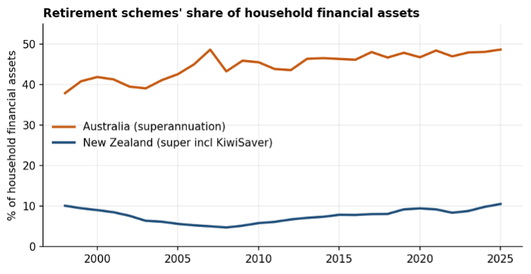
Chart 1¹⁴ shows how much superannuation scheme savings are as a proportion of all households’ financial assets. In New Zealand, it’s about 11% (2025); in Australia, about 49%.
Chart 1 also illustrates two interesting points:
First, despite compulsion, Australian households have added only about 8 percentage points to superannuation’s share of financial assets in 26 years.
Next, New Zealand’s superannuation assets are only just back to their 1999 level despite 18 years of KiwiSaver.
But what about other wealth? Here’s where it could get interesting, though the poor data do get in the way. Chart 2, on the next page, widens Chart 1’s view to all financial wealth at December 2025 (owner-occupied housing is not a ‘financial asset’).
Chart 2
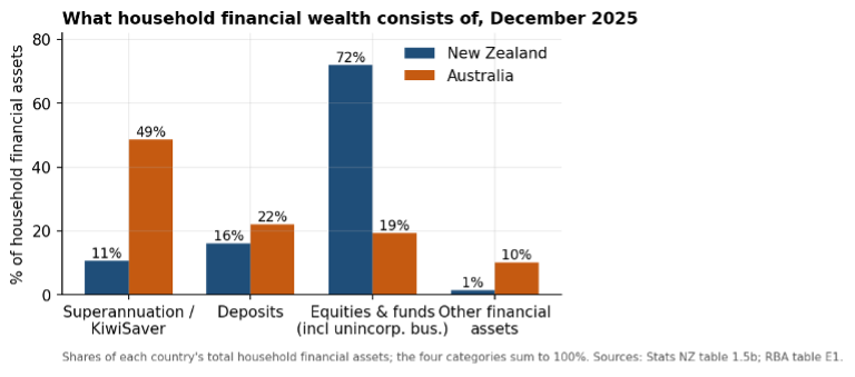
We need to be careful – the two countries categorise assets differently. In New Zealand, rental housing, for example, is classed as a business asset, as are unincorporated businesses. Australia treats rental dwellings and financial assets held through unincorporated enterprises differently. Conclusion? We need much better data.
We are constantly told that New Zealanders have too much invested in houses – both those they live in and rental properties. Chart 3¹⁵ shows the two countries are more alike than not.
Chart 3
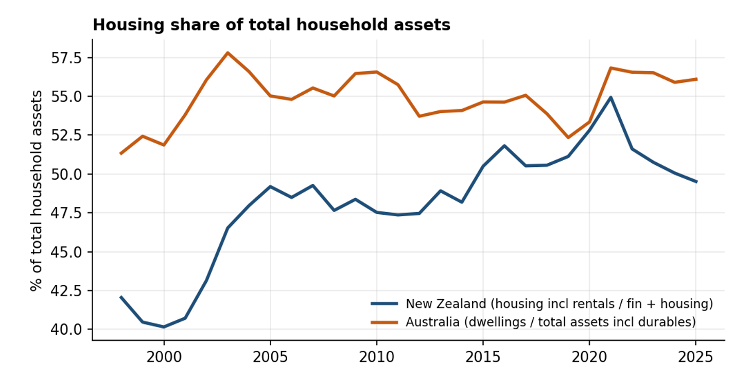
In 2025, dwellings were 56% of total gross Australian household assets while in New Zealand, housing including rental property was about 50% of the total¹⁶.
Whatever compulsory superannuation did to Australian portfolios, it did not displace the house.
Debt, on the other hand, shows a different pattern and one that may be connected to the different ways we save through superannuation. Chart 4¹⁷, on the next page, illustrates this.
Chart 4
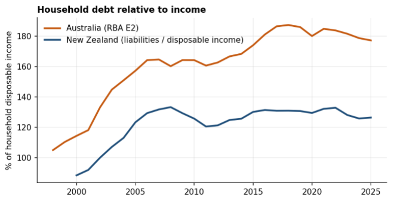
Australian households’ debt rose from 110% of disposable income in 1999 to 177% in 2025. New Zealand debt was about 89% in 2000, rose to 132% in 2007, then fell slightly to 127% in 2025. Relative to household disposable income, it has been essentially flat for two decades.
Australia’s system, which compels saving on one side of households’ balance sheets, appears to have accommodated substantially more borrowing on the other. That could be connected to the SG scheme’s lump sum benefit. Older Australians may tolerate more debt than New Zealanders when they can see it eventually paid off from their compulsory superannuation scheme’s substantial benefit. Other explanations are possible, but the difference between the two countries seems striking.
Some in Australia now think the SG should change to force more retirees into annuity-style benefits. That would probably affect debt levels at older ages.
So, what then of the overall position of households in the two countries? Relative to disposable income, New Zealand’s households are not poorer than Australia’s, as Chart 5 shows.
Chart 5
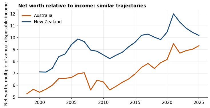
Chart 5 shows that net worth has run at 9-10 times annual disposable income in both countries in recent years.
In fact, New Zealand’s ratio has been at or above Australia’s for the whole period covered in Chart 5. The income denominators are not perfectly aligned, since the Australian measure includes gross mixed income, before deducting interest on debt, but the alignment of the two trajectories is the point: the countries' wealth-to-income patterns look alike, regardless of Australia’s compulsory saving scheme.
Those of an economics-bent might now ask, what about so-called ‘household saving rates’? New Zealand has a dismal record in that regard as Chart 6¹⁸ shows.
Chart 6
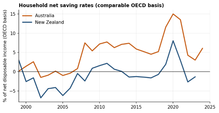
On the OECD's comparable basis, Chart 6 shows that Australian households apparently saved more than New Zealand households in every year, and New Zealand’s net saving has been negative since 2022.
Other things being equal, we should expect a difference. Australians are forced to save for their own retirement and, because of their Age Pension’s means-tests, will receive a smaller state pension from age 67. NZS is universal (from two years earlier, so more valuable) and, unlike Australia, doesn’t require private savings to help pay for it.
However, not too much should be read into Chart 6’s ‘household saving’ numbers. Statistically, they are the difference between two very large ‘flows’: everything the numbers say that households received less everything the numbers say that households spent. This does not mean households ‘saved’ that difference and nor does it mean the difference is all that households saved.
So, although ‘measured flow saving’ is lower in New Zealand (Chart 6), the ‘stock’ of wealth owned by households (Chart 5) tells a different tale.
The next Chart 7¹⁹ shows another view of the superannuation story.
Chart 7
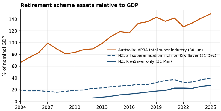
Note: Australian data are at 30 June in each year; New Zealand’s ‘all superannuation’ numbers are at 31 December and KiwiSaver at 31 March.
Every dollar in these pools, on either side of the Tasman, is a claim on future output that will be cashed in by retirees. So, pre-funding clearly increases the amounts held in superannuation schemes but does not abolish the fiscal problem. Instead, pre-funding re-labels it, while also changing its incidence.
Perhaps compulsion (Australia) changes the shape of wealth-ownership patterns by comparison with the ‘more voluntary’ New Zealand environment; or perhaps not. You might expect that compulsion ‘democratises’ wealth (more citizens’ owning more financial assets) but Chart 8²⁰ indicates otherwise.
Chart 8
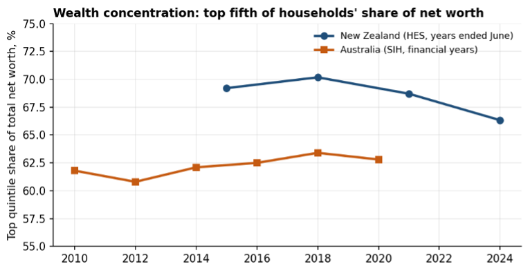
Chart 8 shows wealth concentration within each country, measured by each national survey, with households ranked by net worth in both.
The top fifth of New Zealand households held 66% of net worth in the 2024 survey, down from 70% in 2018; the Australian top fifth held 63% in 2019-20, roughly flat for the ten years covered.
These numbers also demand caution: the surveys differ in design and the Australian data are five years older. But neither country is an outlier and the New Zealand trend is gently towards less concentration, despite having an essentially voluntary KiwiSaver.
So how evenly is wealth spread?
One way of measuring that is to compare average wealth (total wealth divided by the total adult population) with the wealth owned by the person in the middle (the median). This is a very rough, one-number summary of how far the typical adult sits below the average. Chart 9²¹ shows that wealth-spread across six countries.
Chart 9
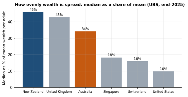
New Zealand has the highest ratio of the six markets shown, at 46% (most ‘even’), against Australia's 34% and Singapore's 18% (both countries with compulsory retirement saving). This measure and Chart 8 answer different questions with different methods and vintages, which is why they can point in different directions without contradiction.
On the UBS model-based estimates (Chart 9), New Zealand wealth is the most ‘middle-weighted’ of the comparators shown, which strengthens my original point (the Herald article of 27 July) that the median New Zealander is comparatively well-placed, despite compulsion (in both Australia and Singapore).
So, what does the future hold for the cost of state pensions? On present settings, are we really headed for a pensions-Armageddon?
On the next page, Chart 10 shows the OECD’s projections for the before-tax cost of public pensions up to 2060 and compares our two countries with the OECD average²².
Chart 10
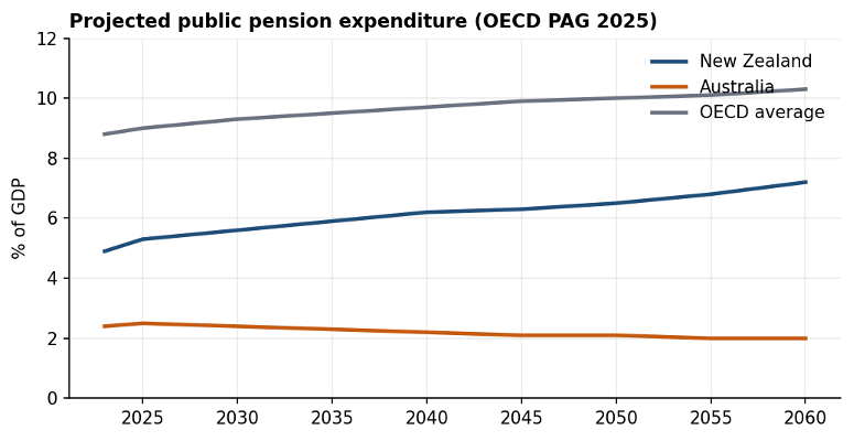
The New Zealand line in Chart 10 (the middle one) overstates the actual cost to taxpayers. NZS is fully taxable whereas Australia’s Age Pension attracts offsets for most so the gross cost there is close to the net cost. Our Treasury’s own estimates put the net cost of NZS at 4.5% of GDP in 2026 (gross of 5.4%), rising to a net 6.2% in 2060 (gross of 7.5%).
However, even on a gross (over-stated) basis, New Zealand’s finishing point of 7.5% in Chart 10 is less than today’s OECD-average number of 8.1% of GDP before tax (in 2021). Does that, by itself, mean we must cut NZS? That should be an open question.
More importantly, the Australian line excludes the cost to taxpayers of superannuation tax concessions, which its own Intergenerational Report suggests will exceed the cost of the Age Pension from the 2040s. With those added, its Treasury shows total Australian retirement income-support roughly flat at around 4.3% of GDP, against the net total cost in New Zealand, currently 4.6%²³ and reaching 6.2% (KiwiSaver aside) by 2060. The gap at mid-century is real but roughly half of what Australia’s plotted line shows in Chart 10.
Australia buys that lower combined result with means-tests and a large compliance apparatus. It effectively requires Australians, while working, to pay for their own financial security in retirement, directly underwritten by the means-tested Age Pension.
In 2025, 42% of Australians over age 67 (the state pension age) received the full Age Pension, unaffected by the means-tests. Another 21% received a part-rate pension and the remaining 37% received no Age Pension at all²⁴.
What about the pensioners?
Given the point of this discussion, which country does it better for pensioners? And how do you measure that?
Australia has had compulsory retirement saving for all employees since 1992 (and a lesser version for union-based employees between 1986-1992). The associated tax concessions and a version of the Age Pension have been around since the early 1900s.
New Zealand’s age pension started in 1898 but the current NZS has been in much its current form since 1977. Tax concessions for private saving were removed in 1987-1990 and KiwiSaver started in 2007.
The arrangements in both countries have been relatively stable for 40 years or more, details aside.
So, what about today’s pensioners? Are poverty levels materially different in each country?
Measuring poverty levels in any group in any country is tricky; comparing groups across countries even trickier.
The OECD defines ‘poverty’ as “…the ratio of the population whose income falls below the poverty line (half the median household income of the total population).” ²⁵
That measure presents difficulties, including that the Age Pension and NZS are both close to the OECD’s income benchmark so changes to either produce seemingly large swings in ‘poverty’ levels. It also ignores housing tenures and, because it depends on just taxable incomes, ignores any capital spending that supports living standards in retirement.
Australia (22.6%²⁶) appears to do better than New Zealand (33.7%) on that measure. Those numbers deserve little respect, however. They refer to different years (Australia 2020; New Zealand 2022) and both are readings off a knife edge.
New Zealand’s rate doubled between the OECD’s 2023 and 2025 editions, from 16.8% to 33.7%, because NZS drifted from 49% to 48% of the median income. The MSD’s own series shows the over-65 rate moving from 7% to 17% to 22% and back to 17% across four survey years, while nothing much happened to actual pensioners.
The Grattan Institute has documented the same artefact in Australia, where measured old-age poverty ‘fell’ from 22% to 12% in seven years as the Age Pension oscillated around the same line. In another Australian survey (HILDA)²⁷, Australia’s over-65 rate in 2022 was 33.5% - indistinguishable from New Zealand’s 33.7%.
After housing costs, both countries land in the mid-teens, with renters carrying almost all of the burden in each.
The next Chart 11 shows the OECD league table²⁸ for what it is worth.
Chart 11
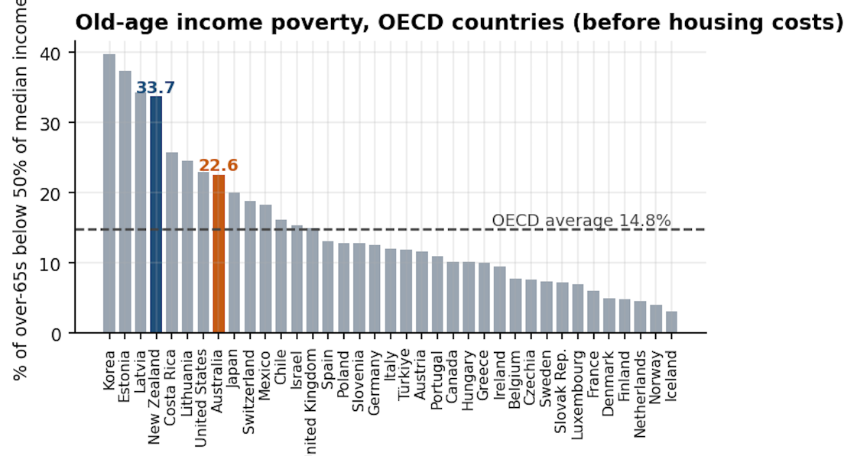
Another measure of poverty is the proportion suffering ‘material hardship’ – having six or more ‘deprivations’, or the inability to afford at least six key goods or services. On that measure, New Zealand’s material hardship is about 4% of over 65s (3.9% in the 2023-24 survey year), with another 3-4% in ‘near hardship’²⁹.
On MSD’s six-band Material Wellbeing Index, 61% of New Zealanders aged 65+ sit in the two most comfortable bands and only 4% in the hardship band, against 9% for the whole population and 13% for households with children.
Australia cannot answer the same question. It has no official material deprivation index for any age group, its financial stress data are not published by age, and the Australian Institute of Health and Welfare notes that data on financial stress among older Australians “are not readily available”³⁰. The closest substitutes point the same way as New Zealand’s figures.
Australia’s 2020 Retirement Income Review found about 11% of retirees in financial stress against 16% of working-age households; compared with 4% of retirees and 9% of the working age population on HILDA’s measure³¹. A UNSW/ACOSS study found 5.6% of Age Pension recipients lacking two or more essentials, against 8.5% of the whole population³².
No study has ever applied a common deprivation index to both countries, as the MSD itself records³³.
Despite the different ways citizens arrive at retirement in both countries, it’s difficult to see a material advantage to Australia on this measure of ‘success’. Compulsory ‘private’ provision seems not to have helped reduce the incidence of poverty amongst the old.
Conclusion
This paper starts with a question: do policy settings change households’ financial behaviour? The percentages in the charts say: it changes the wrapper decisively, the debt side substantially, and the totals barely.
Superannuation's portfolio-share and the assets-to-GDP ratios are transformed in Australia by compulsion. However, debt grew much faster where saving was compelled. The wealth-to-income ratio, the housing share and the concentration measures moved similarly in both countries.
That pattern is what the ‘offset literature’ predicts, and it is the shape of the argument the data will support. In Australia, the government decides how much workers save in the SG Scheme, and when they can get it, but has no control over what workers decide to do with the rest of their money. So private saving decisions will tend to be ‘net decisions’; what individuals decide to save/do after allowing for state provision and, in Australia, compulsion.
The same applies to KiwiSaver in New Zealand.
So, perhaps a government cannot force its citizens to save more than they want to save³⁴.
Despite the seemingly very different environments in Australia and New Zealand, the total costs to taxpayers of each of the two systems are much closer than headlines suggest and the final outcomes are much the same.
It also needs to be said that Australia is a richer country. That’s not so surprising when 60% of its exports are related to mineral wealth (about one-seventh of GDP). We should expect its economy to be stronger and it is. However, the point of this paper is to compare structures and ratios, rather than levels. Superannuation, on its own, is unlikely to explain the difference in overall wealth.
This paper concentrates on just the dollars. That is only part of the story. We should expect the Australian regime’s intricate involvement in personal financial decisions (and the associated means-tests for the Age Pension) to have other impacts. Here is a potential selection:
the effect on labour market participation rates at older ages;
the deadweight cost of tax concessions;
the distortionary effects of both tax breaks and compulsion on individuals’ investment decisions;
the concentration of influence amongst now large financial institutions³⁵, and
the distortions created by the favoured tax-treatment of ‘self-managed superannuation funds’ that are essentially a tax-planning tool³⁶.
The Australian environment tends to encourage confounding ‘sensible’ financial behaviour; of a kind that government regulation then tries to discourage but, at the same time, accidentally encourages (the unintended consequence). For regulators, keen to control behaviour, that can be quite a challenge. Increasingly complex regulation necessarily follows.
What next?
New Zealand doesn’t have decent data. What we have suggest that our retirement income foundations do not need major reform. But that does not mean our current framework is the best it can be. We can do better with the design details of both public and private provision³⁷.
Much better data should be a pre-condition for a full-scale, national discussion. We have never had one of those.
One thing seems clear: I think compulsory KiwiSaver should be parked until we have sufficient data to justify such an extensive intrusion on private saving decisions. Nothing in what we know today suggests that New Zealanders aren’t saving enough³⁸, nor that compulsion will build a more secure retirement income framework or a better outcome for retirees.
Let’s pause and talk; and gather some decent data. There is no rush; we have the time.
Acknowledgements
My thanks to Bryce Wilkinson and Oliver Hartwich of The New Zealand Initiative for their assistance and comments (and to Anthropic's Fable 5 model in Cowork and to Perplexity Computer that were used to check headline figures against the primary sources).
Also, my thanks to Michael Chamberlain of MCA NZ for comments.
The explanations and conclusions are mine.
Footnotes
¹ Michael was a consultant, manager, business owner and academic, all associated with superannuation and retirement income policies over about 40 years. He was a member of the 1992 Task Force on Private Provision for Retirement and the author of How to create a competitive market in pensions – the international lessons (IEA, 1998). Now retired, he maintains his interest in public policy issues associated with saving and pensions and is the principal editor of www.pensionreforms.com.
² UBS Global Wealth Report 2026, media release tables, 30 June 2026. Model-based estimates per adult, converted at market exchange rates.
³ APRA Quarterly Superannuation Performance Statistics, December 2025 quarter (published February 2026).
⁴ Retirement Commission Policy Brief, May 2026.
⁵ We have the New Zealand Superannuation Fund that will eventually add a relatively insignificant contribution to NZS-outgo down the decades (starting in 2054; maximum about 13% in 2086 - Treasury: NZSF Contribution Rate Model, Budget Economic and Fiscal Update (BEFU) 2026. It doesn’t really change the PAYG categorisation.
⁶ There are also special rules for an immigrant who has an entitlement to a state pension from another country.
⁷ Australia’s state pension age was raised from 65 to 67 between 2017 and 2023.
⁸ The Treasury’s 2025-26 Tax Expenditures and Insights Statement, 17 December 2025.
⁹ Auditor-General Report No. 20 of 2025-26: outlay of A$62.2 billion in 2024-25.
¹⁰ Both contributions are based on the employee’s gross pay. The employee’s contribution is deducted from net pay but the employer pays tax (ESCT) out of its gross contribution, on the employee’s behalf, based on the employee’s marginal tax rate. Only the net amount reaches the KiwiSaver scheme.
¹¹ Treasury: NZSF Contribution Rate Model, Budget Economic and Fiscal Update (BEFU) 2026.
¹² Crown Core Expense Tables, Budget Economic and Fiscal Update 2026.
¹³ Australia has Household, Income and Labor Dynamics in Australia (HILDA Survey), a longitudinal study of households that started in 2001. New Zealand has no equivalent, so this paper’s comparisons are constrained by the data we have available.
¹⁴ StatsNZ National accounts data, supplementary tables 1.5b and 1.5a (March 2026); Reserve Bank of Australia Tables E1 and E2 (December Quarter values).
¹⁵ Source: as for footnote 14.
¹⁶ In Housing Taxation in OECD Countries, the OECD estimates that housing comprises “…50% of total household wealth on average across the 29 OECD countries with available data.” (OECD, 2022).
¹⁷ Source: as for footnote 14.
¹⁸ OECD National Accounts at a Glance, 2025.
¹⁹ KiwiSaver: FMA KiwiSaver annual reports 2012-2025. Also, StatsNZ table 1.5b 'net equity in superannuation funds' (includes KiwiSaver). APRA Annual Superannuation Bulletin: Quarterly Superannuation Performance total industry assets.
²⁰ Stats NZ, Household net worth statistics: year ended June 2024 (nominal dollars); ABS Household Income and Wealth, Australia (cat. 6523.0), 2019-20 issue, Table 2 (constant 2019-20 values).
²¹ UBS Global Wealth Report 2026 (17th edition), media release tables, 30 June 2026. Chart 9 says nothing about the distribution of wealth on either side of the median.
²² OECD Pensions at a Glance 2025 Table 7.2.
²³ Including, now, the cost of KiwiSaver subsidies of 0.1% of GDP.
²⁴ The Australian government does not publish these percentages directly. The quoted numbers are derived from the Australian National Audit Office’s, Administration of the Age Pension, Auditor-General Report No. 20 of 2025-26, tabled 27 January 2026 (2.67 million Age Pension recipients at June 2025; 66.41% at the full rate), and the ABS’s National, state and territory population, June 2025, estimated resident population by single year of age (4,261,449 people aged 67 and over at 30 June 2025). Those receiving no Age Pension include veterans on DVA service pensions, some recipients of other income-support payments and recent migrants who do not meet the 10-year residence requirement, as well as those excluded by the means-tests.
²⁵ OECD Old-age income poverty: Pensions at a Glance 2025.
²⁶ The Grattan Institute thinks that should be more like 8% after accounting for the deficiencies in the OECD’s measure: Why Australia’s old-age poverty rates are a lot lower than you might think (Coates, B. and Chen, T., Grattan Institute blog, 10 April 2019).
²⁷ Bray, J.R., Relative income poverty (HILDA Wave 22), POLIS at ANU, February 2024.
²⁸ Pensions at a Glance 2025: Table 7.2, with Australia and New Zealand highlighted. The Australian number is for all aged 66 or more. The state pension age was then 66. It is now age 67.
²⁹ MSD The financial and material wellbeing of older New Zealanders (Bryan Perry, MSD Working Paper 01/25, 2025).
³⁰ Australian Institute of Health and Welfare, Older Australians, key data gaps, 2024
³¹ Retirement Income Review 2020, Chapter 2 – Adequacy at p 136.
³² Naidoo, Wong, Smyth and Davidson, ACOSS/UNSW, November 2024, pp 42-43.
³³ MSD, Child Poverty in New Zealand, 2026 edition, pp 30-31
³⁴ Another two-country comparison (between Australia and Germany) found that citizens in both countries are, despite the very different national settings for both public and private provision, expected to have about the same living standards, with similar distributions [in retirement]: Living Standards in Retirement: Accepted International Comparisons are Misleading (Frick, J.R. and Headey, B. (2009), Schmollers Jahrbuch / Journal of Contextual Economics, 129(2), 309-319. Again, citizens make their ‘net’ private decisions in the context of the public framework (with similar overall outcomes).
³⁵ The largest superannuation scheme in Australia at 31 December 2025 was AustralianSuper. It held A$410 billion or 9.1% of all Australian superannuation assets (APRA’s Quarterly Superannuation Performance statistics for December 2025). The top five schemes hold about 28% of the total (about 40% of APRA-regulated assets).
³⁶ SMSFs were 24% of total superannuation assets at 31 December 2025.
³⁷ See, for example, Informing the 2019 Review: 133 questions New Zealand needs answered (2019) a submission to the Retirement Commissioner’s 2019 Review that I co-authored with Michael Chamberlain. It is online at www.alt-review.com
³⁸ StatsNZ looked at this issue 20 years ago in the Survey of Family Income and Employment (SoFIE), a longitudinal study of a large sample of households between 2002 and 2010. Before KiwiSaver started in 2007, we discovered that many New Zealanders may have been ‘over-saving’ for retirement (based on some relatively conservative assumptions). That might still be the case, 20 years on.